5 Facts About Standard Infographic Dimensions!
Are there any standard infographic dimensions? That’s the first question I asked when beginning my first infographic. After searching far and wide, my answer was a big, resounding NO.
Great, so why is that even in the name of this post? I took a look at the 200 most-viewed infographics on Visual.ly. We’re going to look at the dimensions of successful infographics and get an idea of some best practices.
Below is a (meta!) infographic detailing my findings.
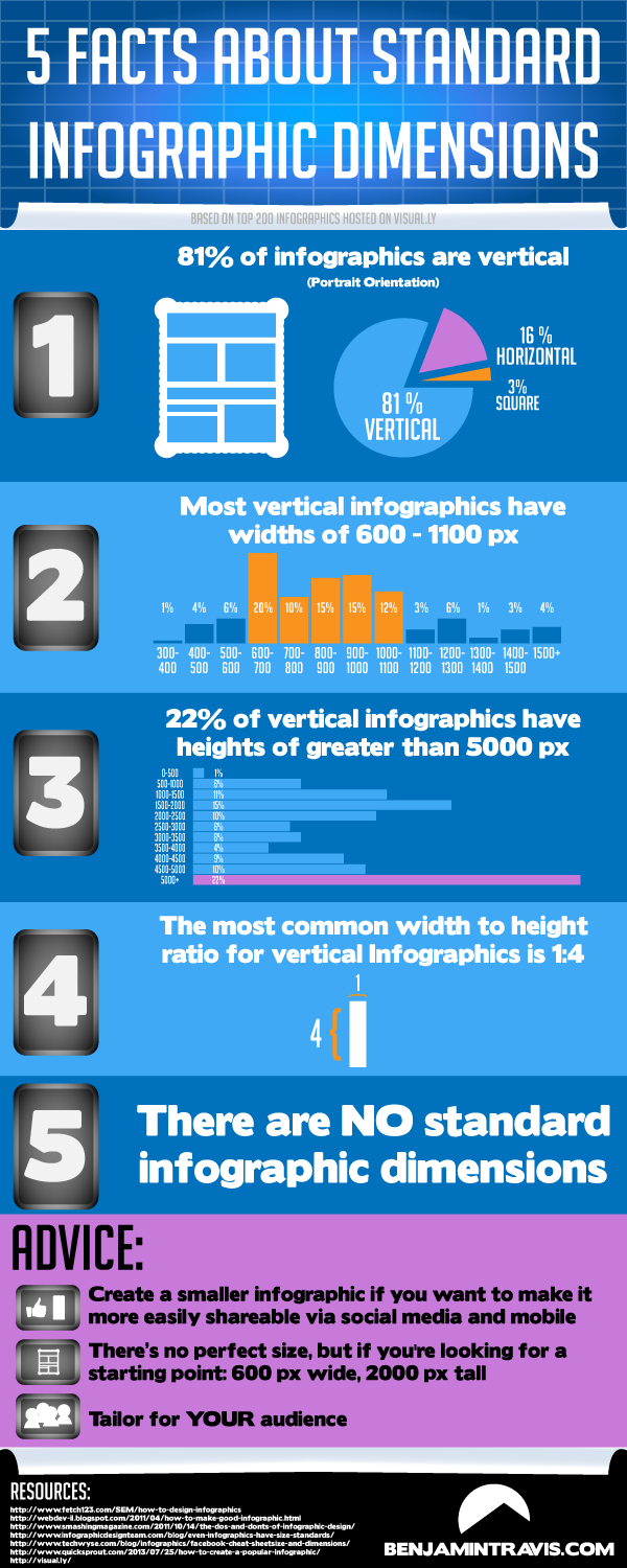
1. Orientation
Before even starting out on Illustrator, I sketch out ideas on paper. Before that, I need to figure out what the orientation is going to be. After recording the dimensions of the most popular infographics on the web, I thought back to these first steps of the infographic design process. In the past, I’ve always chosen vertical (or portrait) orientation. How does this compare to the rest of infographics?
It turns out 81% of the top creations I reviewed are also vertical, as opposed to horizontal orientation or square. A horizontal orientation may be preferable based on content or for horizontal-only tablet apps. But in today’s Facebook-centered, infinite scroll-addicted world, it’s not surprising that 4 out of every 5 infographics are vertical.
2./3. Height and Width
Ok, you figured out your orientation…now how big or small do you want your infographic to be? This depends on the application of your data visualization. Some advocate having width no more than 600 px. Limiting yourself is never a good idea, so take that with a grain of salt. Yes, you may want to optimize for smaller screens or social media – then again, you may want a huge infographic. You may even want a 14 foot-wide click and drag map.
But what did the study show about pixel size? Almost all vertical infographics are 600-1100 px wide. As for height, that’s a bit more complicated. The beauty of infographics is that you can make them however long you need! There are actually two buckets we can put height in. First, the shorter infographics, which center around 2000 px. Second, the mega long ones, which reach more than 5000 px (and sometimes more than 20,000 px). For those with horizontal orientation, the most common width and height are 1200 px and 900 px, respectively.
4. Ratio
The most common width to height ratio for vertical infographics is 1:4, roughly the dimensions of the Empire State Building (sans antenna). With a general width of 600-1100 px, that should take you about two or three scrolls to finish reading. For horizontal works, that ratio turned into 3:2, much closer to your computer screen dimensions.
5. There are no standard dimensions!
You bozo! I already told you, there aren’t any standard dimensions, but now you can use these findings to give yourself a little more guidance when designing.
Advice:
Choose a smaller size if you’re going to share on social media. Short attention spans mean that people want data snacks, not a data dinner.
There’s no perfect size, but if you want to start out with some specific dimensions, try this out: 600 px wide, 2000 px tall. Didn’t fill everything out? Make it shorter. Trying to optimize for an iPhone screen? Make it skinnier.
Tailor for your audience. You can get recommended dimensions or sizes from anyone, but in order to make a good infographic – no, a great infographic! – you need to know your audience. Ask yourself how your audience will look at the data visualization (e.g. will they use a mobile publishing format like AMP, Instant Articles, or Apple News) and what they’ll be looking for. Now go, be fruitful and illustrate!
And a quick thanks to all the resources out there:
- http://www.fetch123.com/SEM/how-to-design-infographics
- http://webdev-il.blogspot.com/2011/04/how-to-make-good-infographic.html
- http://www.smashingmagazine.com/2011/10/14/the-dos-and-donts-of-infographic-design/
- http://www.techwyse.com/blog/infographics/facebook-cheat-sheetsize-and-dimensions/
- http://visual.ly/
P.S. When posting an infographic, be sure to fill in the alt text field of the image, allowing users with disabilities to understand the underlying premise of the infographic (whether you’re talking about space heaters, space invaders, or Space Jam), in addition to giving search engines a better idea of what’s included in the image — part of SEO basics.